Ranking Sports by Number of Athletes
Dutta (2018) in his Kaggle post visualized the top 10 sports that USA excel by putting 10 boxes vertically with sports winning the most gold medals on top. See Figure 11.
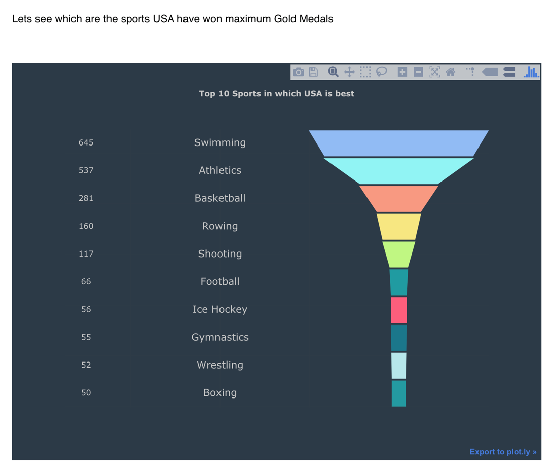
Figure 11: Ranking of sports by weighted medals
This visualization is transparent and clear but the problem is that it is limited to only about 10 items, which is not enough for us to visualize all the sports in the Summer Olympics. Instead, we decided to try a bar chart and word cloud for our visualizations.